Redesigning a Medical Device App for an Unassisted User
Role: Product Design — usability research, prototyping, and iterative testing on the companion app for the BioSleeve® wearable rehabilitation device
Tools: Adobe XD, Photoshop, generative and evaluative research, usability testing
Duration: 6 months
The Situation
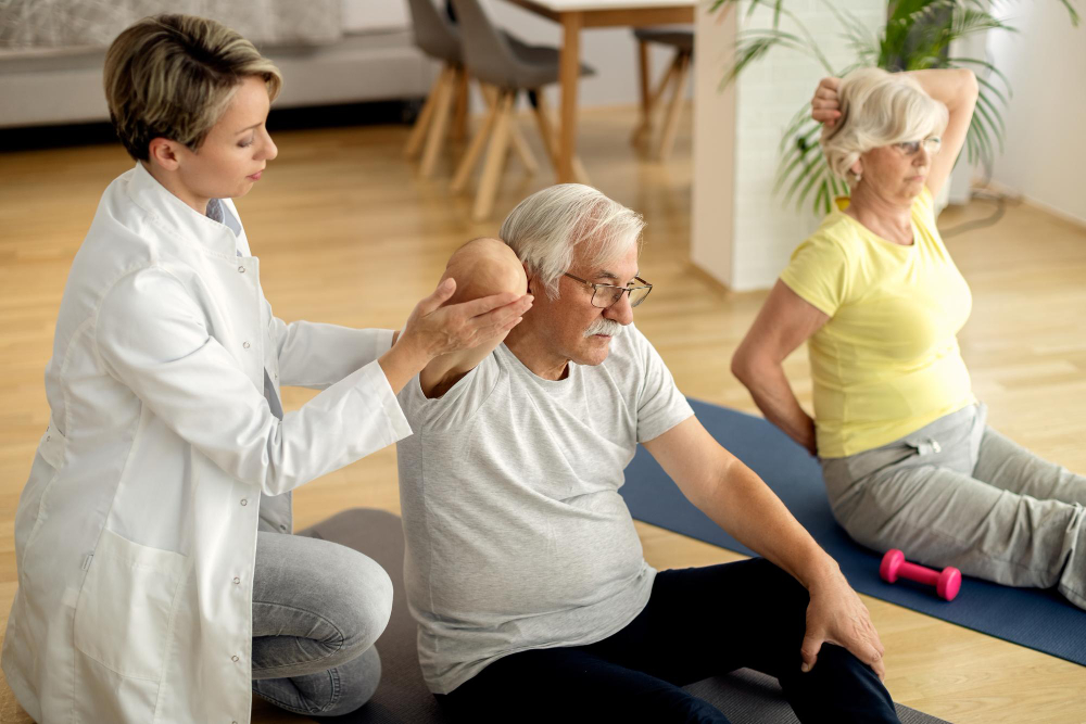
Cipher Skin built the BioSleeve®, a compression sleeve with embedded sensor technology that lets physical therapists monitor patients remotely, track motion and biometric data, and build personalized treatment plans. The companion app was the interface between patient and practitioner.
The original product assumed one thing: a trained staff member would always be nearby to help patients get set up.
Then COVID-19 changed everything.
The Market Shift That Defined the Problem
As in-clinic visits became a risk factor — especially for older and higher-vulnerability patients — the product’s core assumption broke down overnight. Patients were sent home to continue rehabilitation independently, and suddenly the app’s most critical user was one it had never actually designed for: someone who needs help but doesn’t have any.

This wasn’t just a usability problem. It was a product gap with direct business consequences:
- Patients who couldn’t complete setup couldn’t complete therapy
- In a field where patients are billed by the hour, a 15+ minute setup process was creating real friction and concern for practitioners like Christy, one of our expert users
- The original flow required 7+ screens just to connect a device — before any therapy had even started
The product had a retention and adherence problem masquerading as a setup problem.
Research: Understanding Who Got Left Behind
I opened with generative research focused on the newly unserved segment, which were patients with physical limitations attempting independent home rehab for the first time.
Methods: Contextual inquiry, expert interviews (physical therapists), patient interviews, surveys, and moderated usability testing.
Key focus areas during shadowing and SME interviews:
- Vocabulary and language therapists used with patients to understand what “plain language” actually meant in this context
- Types of data practitioners used to assess performance
- Communication patterns between therapist and patient
What I learned:
Most patients were failing because they lacked the vocabulary to parse the instructions and not failing because the product was too complex and abstract. Terms like abduction and adduction were routine to practitioners and meaningless to patients. When I asked users to describe exercise positions in their own words, they said things like “spread your wings and fly” and “pretend you’re driving a bus.” That gap between expert language and user language was the design problem.

Beyond language, the research surfaced three compounding barriers:
- Physical pain and limited dexterity — setup required fine motor interactions that were actively difficult for patients in recovery
- Fear of doing it wrong — patients expressed hesitancy and anxiety about making mistakes without a professional present
- Information architecture failures — the navigation structure made it easy to get lost and hard to recover from errors
Journey mapping and heuristic evaluation confirmed the friction points:
| Heuristic | Issue Found |
|---|---|
| Visibility of System Status | No feedback indicating whether devices were successfully paired |
| Recognition & Findability | Inconsistent labeling and weak affordances led to disorientation |
| Error Prevention | Mistakes weren’t surfaced clearly; recovery paths were unclear |
Defining the Opportunity
Problem statement: Patients who rely on clinical assistance need a way to complete device setup independently at home without compromising their confidence or their care.
Hypothesis: If the interface was simplified and instructions were made legible in plain language, first-time users could complete device connection and calibration without assistance which could reduce setup time by ~50% and improving adherence.
Success metrics:
- Setup completed in under 10 minutes (down from 15+)
- Task completion without external assistance
- User-reported confidence during setup
Business case: Reducing setup friction wasn’t just a UX improvement, it unlocked a new use case entirely. If patients could set up independently, Cipher Skin could extend its market to home users on a HEP (home exercise program), and practitioners could reclaim time previously spent on device onboarding.
Design Decisions & Rationale
Every design choice was driven by a specific barrier identified in research.
1. Reducing cognitive load through progressive disclosure – I limited each screen to one or two calls to action, eliminating decision paralysis at the moments patients were most likely to be frustrated or in discomfort.
2. Anchoring instructions in familiar mental models – I used comparative research to find analogies that mapped to users’ existing knowledge. Pairing the sleeve to connecting AirPods gave patients a familiar framework for a technically unfamiliar process. Nintendo Wii’s instruction language inspired how we wrote physical movement directions — action-oriented and jargon-free.
3. Redesigning the setup flow end-to-end – The original flow required users to leave and re-enter the app, repeat steps, and navigate 7+ screens before starting. The redesigned flow kept the entire task contained in-app, added visual pairing confirmation, and introduced auto-recognition for previously paired devices — eliminating two steps for returning users.
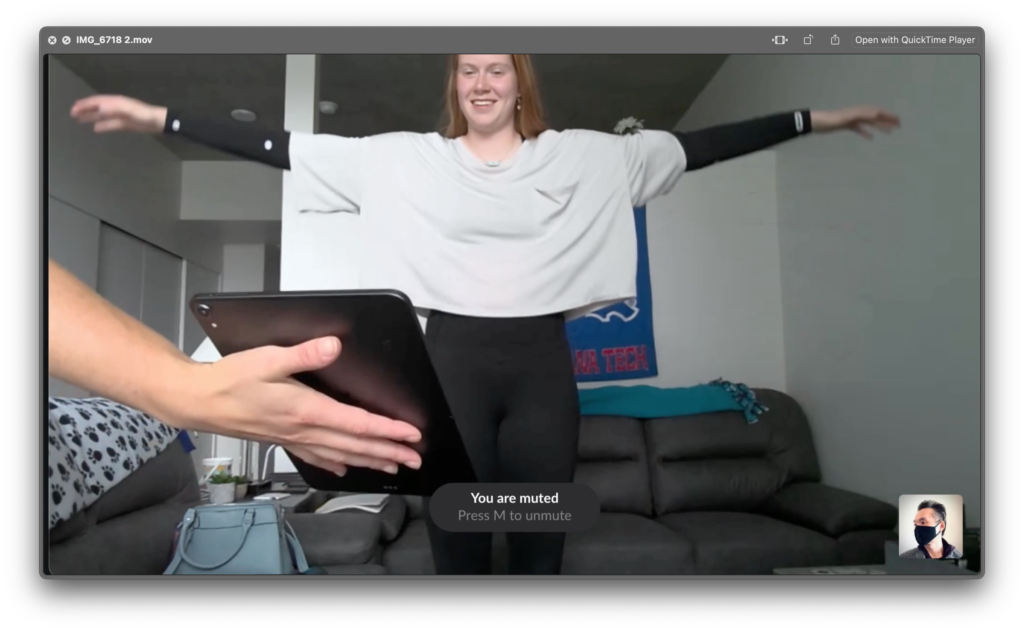
4. Adapting the interface to the physical context of use – During testing, I observed users placing tablets flat on surfaces and craning their necks during calibration. In response, I designed dynamic text scaling — enlarging instructions when users were expected to step back and perform movements, then returning to default once calibration completed. This was a context-of-use decision, not just an accessibility one.
5. Proposing audio instruction as a multimodal layer – Because patients can’t always look at a screen while performing exercises, I proposed AI-generated spoken instructions as a complement to on-screen text — allowing users to maintain posture and form without switching attention to the device.
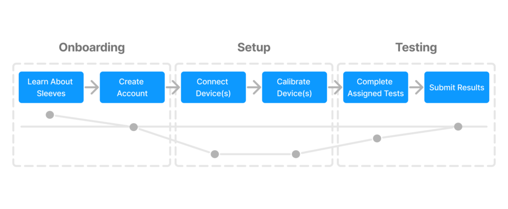
Testing & Iteration
I recruited 5 participants varying in age and technical background for moderated usability testing at Cipher Skin’s Denver office. A co-moderator helped capture behavioral observations while I ran sessions.
What we were measuring:
- Could users complete setup tasks without prompting?
- Could they read and follow instructions from a realistic distance?
- Were affordances and navigation clear without explanation?
Key findings from testing:
- Users frequently asked for reassurance during navigation. This signaled that the system wasn’t communicating state clearly enough.
- Calibration animations weren’t reflecting user movement accurately, creating uncertainty about whether steps had been completed.
- Enlarged on-screen text significantly improved legibility during range-of-motion tests.
- Tablet positioning varied widely (flat on table, propped on chairs) — indicating an unresolved physical context problem worth further study
These observations fed directly into a second prototype iteration.
Outcomes
| Metric | Result |
|---|---|
| Task Success Rate | +20% |
| Setup Time | -40% |
| Patient Adherence Rate | +27% |
Beyond the numbers, the redesign shifted the product’s addressable user base. By designing for the most constrained user — a recovering patient, alone, unfamiliar with the technology — the new flow also improved the experience for in-clinic users, who benefited from shorter onboarding and fewer interruptions from patients who needed help.
Reflection
This project reinforced a principle I carry into every product problem: designing for the most constrained user raises the floor for everyone. Accessibility decisions made for patients with limited dexterity, low technical literacy, and no assistance present produced a cleaner, faster experience that in-clinic power users also preferred.
The most valuable research insight wasn’t quantitative — it was the vocabulary gap. Understanding that patients and practitioners operated in completely different linguistic registers reshaped the entire content strategy. Plain language wasn’t a nice-to-have; it was load-bearing.
Note: In compliance with my NDA, confidential information has been omitted or obfuscated. All content reflects my own work and perspective.