
TMNT Sewer Studio Tour
Role: UX/UI Design
Platform: Interactive installation
Challenge: Encourage attendees to interact and share their content.
Solution: A fun, interactive experience that generates an easily shareable video that features the new toy line.
Tools: Adobe After Effects, Illustrator, Photoshop, Xd.
Timeline: 2 weeks
About the project
We were tasked with creating an experience for children across the country to learn and experiment with stop motion animation while promoting products and generate buzz.
The biggest challenge was to make a complex concept such as stop motion animation easily understandable and learnable within a short period of time.
Research
For this project, I spent a couple weeks doing research on similar products that offered the functionality of creating your own stop motion animation. My main focus was on how onboarding the experience would be and how the controls would help make the experience better.
In addition to the demands of an instructional sequence, we were also asked to implement real-time sharing that allowed users to share their content immediately after their experience as a form of marketing to their peers.
Process
When we first started this project, we were weary of working with a demographic that we weren’t all that familiar with, children. Most of the projects we have done have been more or less for the general public, usually people with at least a high-school level of education.
What we knew:
- Both children and parents would be involved in the experience, but both are not necessary to succeed in the process.
- Time is restricted to only 7 minutes per visitor to maximize foot traffic.
- The experience will be mobile, needed to travel across the country to 10 different locations.
- Will be amongst several other installations.
What we didn’t know:
- Will children understand this information?
- How much will the parents interact?
- Is 7 minutes enough time to go through a memorable experience?
Prototyping
Once we had a good idea of what our clients needs were, we sketched up some wireframes to test our user flow and got some initial feedback.
Here’s one of the initial wireframes we mocked up for our client to walk them through the experience.
And here is another wireframe using assets we got from our clients.
Testing
After we created our initial prototype, we wanted to test it in it’s intended space to make sure all tolerances were taken into account. We were looking at things such as height, camera angle, and maneuverability – basically checking to see if we were offering the appropriate affordances a child and parent would need to go through this experience the way it was intended.
We asked some friends and their children to try out our first few iterations and give us input on how we could improve it. Feedback included:
- The instructions were too much to read or unclear.
- There isn’t enough time to complete the tasks, or took longer than they’d like.
- They wanted to see more options for intros and endings.

We built the stage of our experience low enough for children to interact with but also at a height appropriate for the ideal outcome of the footage that the user will be creating. We had to make some compromises to make this happen.

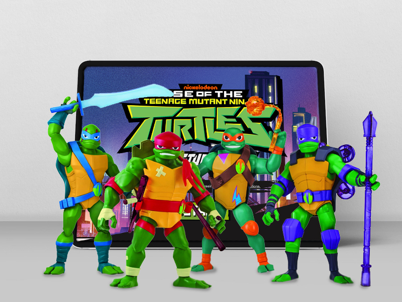
We used toys that were readily available in-store as a backdrop for the video content that would the children were going to make. The children were able to set up their own scenes and play out their own stories.

Design
Here are a few samples of the screens we designed. Most of the design elements were provided in a design system that was already created. But I took some liberties of creating my own by repurposing some existing elements.


Overall, the project was a success. We were able to process nearly 1,000 videos per day and create an experience that the children enjoyed.
